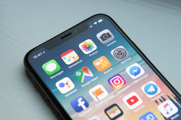
A patient searches for a dentist on their phone at 3 PM, scrolling between appointments. They find your practice in Google results, click your website, and wait. The page loads slow, text is too small to read without pinching, and the "Book Appointment" button is so small they tap it three times before hitting it. They give up and call your competitor instead.
This happens 62% of the time — more than half of dental patient searches start on mobile. Yet most dentist websites still aren't built for mobile. Tap targets are tiny. Forms are slow to load. Photo galleries render on desktop speeds. Click-to-call links are buried or broken. And patients are leaving for competitors who got mobile right.
Here's what you need to know: mobile performance isn't a nice-to-have. It directly impacts how many appointment requests you get. A free website audit from RankLoft shows this in real time.
Why mobile matters for dentist websites
Before we dive into the fixes, understand the stakes. According to research from eMarketer and Google, 77% of dental patients search online for doctors. 58% start with Google search — and Google's ranking algorithm now prioritizes mobile performance as a primary signal. If your site is slow on mobile, you won't show up where patients are looking.
Here's what the data actually says:
When someone on mobile can't read your site, or it takes 4 seconds to load, they bounce. Not to another section. Off your site entirely.
6 common mobile failures (and the fix)
1. Tap targets that are too small
Your "Book Appointment" button is 30px wide. On a phone screen, that's invisible. Patients miss it, tap the wrong area, get frustrated, and leave. This is the number-one usability failure we see on dentist sites. The fix is simple: every clickable element must be at least 48px tall and 48px wide. That includes your phone number link, all navigation buttons, form fields, and CTAs. On mobile, bigger is better.
2. Booking forms that slow down the page
A common mistake: your appointment booking form loads third-party scripts (calendar, form builder, payment processor) that take 3–5 seconds to render. A patient starts filling it out, the form still hasn't loaded, they think the site is broken, and they call a rival dentist instead. The fix: host your form on fast infrastructure, lazy-load non-critical scripts, and remove form fields you don't actually need. Every question you ask is a chance for them to abandon.
3. Photo galleries that load slowly on mobile
You've got a gallery of your office, treatment rooms, and before-and-afters. On desktop it looks beautiful. On mobile with a 4G connection, it loads 10 unoptimized 3MB photos sequentially. Patients sit staring at a blank page for 6 seconds. The fix: compress images to 500KB or less, use WebP format (smaller, no quality loss), and lazy-load images so only visible photos load immediately. Unsplash or similar free stock photos work fine too.
4. Text that requires pinch-to-zoom to read
Your desktop site has an 11px sans-serif font. On mobile, it renders at 8px — too small to read without zooming. This is usually caused by missing or incorrect viewport meta tags. Patients get frustrated and assume your practice is outdated. The fix: set your viewport tag correctly (``), use 16px or larger for body text, and ensure your site is responsive (adapts to screen size, not fixed-width).
5. Click-to-call links that don't work or are hidden
Your phone number is text only. A patient on mobile has to manually dial it — or worse, they don't see a phone number at all. The fix: use proper `` links, make your phone number a sticky header element on mobile so it's always visible, and test that tapping the number actually initiates a phone call on real phones.
6. Navigation that collapses badly or is hard to use
Your full desktop menu has 10+ links. On mobile, they're squeezed into a hamburger menu that requires two taps to navigate. Patients get lost looking for "Contact" or "Hours." The fix: simplify mobile navigation to 4–6 key links (Home, Services, Reviews, Contact, Book). Sticky header with the phone number and CTA button. Make it obvious how to get what they came for.
What a mobile-ready dentist site actually needs
It's not just about fixing individual elements. A mobile-ready dentist site runs on three pillars:
1. Speed. Patients expect your site to load in 3 seconds or less. If it takes 4 seconds, 40% of them leave before the page even renders. Every second of delay costs you ~20% of appointment requests. The fix: optimize images, minify CSS/JavaScript, enable caching, use a fast host (or a CDN like Cloudflare). Aim for a Lighthouse performance score of 80+.
2. Core Web Vitals. Google measures three core metrics on mobile: LCP (time to show the main content), CLS (layout shift — does your page jump around while loading?), and INP (responsiveness — does it feel snappy?). Sites that pass these rank higher in Google Search. More importantly, they convert more patients. A dentist site that optimizes Core Web Vitals can see 10–40% more appointment requests.
3. Responsive design. Your site must adapt fluidly to any screen size. This isn't about showing/hiding elements. It's about proportions, spacing, and layout that work at 320px (old iPhones) to 480px (modern phones) to 768px (tablets). Use CSS media queries, flexible grids, and fluid typography. Test on real devices before deploying.
Want this handled for you?
RankLoft builds mobile-first dentist sites that load fast, rank on Google, and turn patient searches into booked appointments.
Get a free site audit →Mobile performance also improves your Google rank
Google's ranking algorithm now uses mobile performance as a primary ranking factor. In 2024, they integrated Core Web Vitals directly into search rankings. This means: if your competitor's dentist website loads in 2 seconds on mobile and yours takes 5 seconds, they'll rank higher than you in Google Search — even if your content is better. Mobile speed is a tiebreaker that determines who shows up first when patients search.
A technical SEO audit can also reveal mobile-specific issues like missing responsive images, unoptimized fonts, or render-blocking JavaScript. These are quick wins that move the needle on rankings.
Frequently asked questions
How much does it cost to make a dentist website mobile-friendly?
If you're rebuilding from scratch, expect $1,500–$5,000. If your current site is responsive but slow, optimization runs $300–$1,200. Core Web Vitals fixes (image optimization, lazy loading, code cleanup) typically take 10–20 hours at freelance rates or are included in a new build.
How long does a mobile website take to build?
A full rebuild: 2–4 weeks. Mobile optimization of an existing site: 1–2 weeks. Small fixes (button sizing, form streamlining, image optimization) can ship in days. Google Search Console flags critical mobile issues in real time, so you know immediately what's costing appointments.
Will a mobile-friendly site help my dentist practice rank on Google?
Yes. Google's ranking algorithm uses mobile performance as a primary signal. Passing Core Web Vitals (LCP, CLS, INP) is tied to search visibility. If your site takes 5 seconds to load on mobile, a competitor with a 2-second site will outrank you, even with similar content. Mobile speed is a tiebreaker.
What's the single most important mobile fix for a dentist website?
Page load speed. If your site loads faster than 2 seconds on mobile, bounce rates drop by 97%. A slow site (4+ seconds) loses 40% of traffic before it even renders. Optimizing images and removing bloated code is the fastest win.
Can I test my dentist website on mobile myself?
Yes. Use Google Lighthouse (built into Chrome DevTools) to run a mobile audit, or check Google Search Console's Core Web Vitals report. Both are free. Lighthouse grades performance, accessibility, and SEO. A score below 50 means you're losing patients to load time alone.
The bottom line
Mobile isn't the future of dentist websites. It's the present. 62% of patient searches happen on phones. Google ranks mobile-first. And if your site doesn't work on mobile, your competitors are already capturing those patients. The good news: fixing mobile is straightforward. Optimize images, simplify your booking form, make buttons bigger, and get your load time under 3 seconds. The payoff is measurable: 10–40% more appointment requests, immediate lift in Google rankings, and patient trust that your practice is modern and easy to reach.
Start by running a free Lighthouse audit on your site. Chrome DevTools → Lighthouse → Mobile. If your score is below 80, you're losing appointments every day. Let's fix that.
Sources
- Huckabuy — 20 Important Page Speed, Bounce Rate, and Conversion Rate Statistics
- eMarketer — How Consumers Shop Online for Doctors
- Google web.dev — The Business Impact of Core Web Vitals
- Google Think with Google — Why Marketers Should Care About Mobile Page Speed
- Google Developers — Core Web Vitals
- WebsiteSpeedySo — How Do Core Web Vitals Impact Your Conversion Rates?
- WP Rocket — Website Load Time Speed Statistics
- Digital Applied — Page Speed Statistics 2026: Revenue Impact