Pull out your phone and search "auto shop near me" or "HVAC repair Denver." You'll get a list of local businesses. You'll tap one. And if that site opens as a tiny, squished desktop page you have to pinch just to read — you're closing it and calling someone else.
That's the situation. The majority of local searches now happen on a phone rather than a desktop — Google has indexed the mobile version of sites first for years. A site that doesn't render correctly on mobile is turning away most of the people who find it. They just never call, so the business never knows.
We picked three real Denver contractors — an auto shop, an HVAC company, and a mechanical contractor — all on WordPress, and opened each site on a 390px-wide phone. Here's exactly what we found, with screenshots.
These are real businesses serving real customers. The issues below are observed facts from live sites. Every problem here is common and fixable. We're sharing them because they're instructive, not to embarrass anyone. All three of these businesses are winning on reputation — the question is how many more calls they'd get if their sites worked on a phone.
The teardowns
Painter's Grinding VW Specialists is an established auto machine shop with loyal customers. But loyal customers already have the number saved. The people you need to convert are the ones searching cold on a phone at the moment they need help.
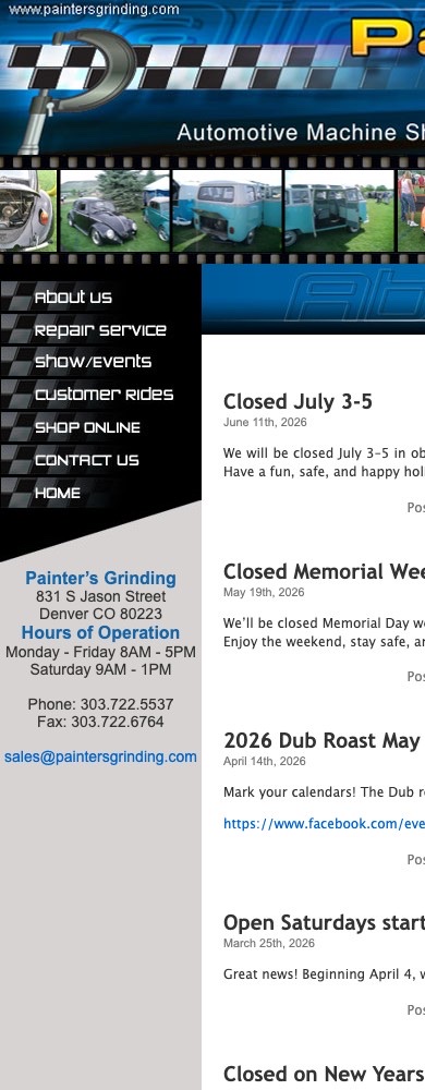 Live site on a 390px phone
Painter's Grinding VW Specialists
On a phone the desktop layout doesn't reflow — the logo banner is cut off and post headlines run off the right edge.
What we verified
- No HTTPS — The site loads only over plain http; there is no secure https version, so Chrome labels every page "Not Secure." Google treats HTTPS as a ranking signal.
- Not built for mobile — There's no mobile-viewport tag and no responsive layout, so on a phone the page renders at desktop width and content spills off-screen — and Google indexes the mobile version first.
- Phone number isn't tap-to-call — The number is plain text with no tel: link, so mobile visitors can't tap to dial.
Performance Air Cooling handles commercial refrigeration and HVAC — the kind of work where a broken walk-in cooler at 2 AM means someone is pulling out their phone immediately. That search-to-call moment is exactly when a site that doesn't render on mobile loses the job.
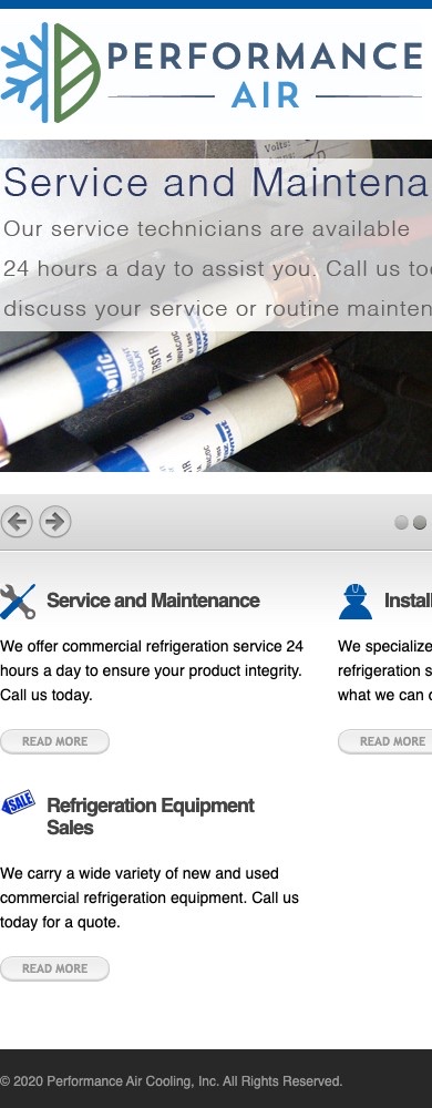 Live site on a 390px phone
Performance Air Cooling
On a phone the hero headline and the service columns are cut off at the right edge — the layout doesn't adapt.
What we verified
- Not built for mobile — No mobile-viewport tag; on a phone the headline and service columns run past the edge of the screen instead of stacking.
- Footer still reads © 2020 — The copyright line at the bottom of the page still says 2020 — a freshness signal that the site hasn't been updated in years.
- Phone number isn't tap-to-call — The number is plain text with no tel: link, so mobile visitors can't tap to dial.
LDI Mechanical does HVAC and mechanical contracting — work where the first contractor to answer usually wins the bid. If your site navigation collapses into a clipped mess on the phone someone is using to find you, that call may never happen at all.
 Live site on a 390px phone
LDI Mechanical, Inc.
On a phone the navigation links overflow and get clipped at the right edge instead of collapsing into a menu.
What we verified
- Not built for mobile — No mobile-viewport tag; the desktop navigation overflows the screen on a phone rather than collapsing into a usable menu.
- Footer still reads © 2019 — The copyright line at the bottom of the page still says 2019 — the site hasn't been refreshed in years.
- Phone number isn't tap-to-call — The number is plain text with no tel: link, so mobile visitors can't tap to dial.
Quick-audit scores at a glance
The scores above are our quick audit based on the specific issues documented — not a comprehensive Lighthouse pass, not a full technical crawl. They reflect only what we verified on each site.
Painter's Grinding scored lower (38) because it has the added problem of no HTTPS on top of the mobile and tap-to-call gaps. The other two scored 45 — still well below what a functional, modern site would produce, but the HTTPS issue wasn't present.
The pattern: this isn't about WordPress
All three sites run WordPress. But that's not what caused these problems. WordPress can produce fast, mobile-friendly sites — it's one of the most widely deployed platforms on the web and plenty of great contractor sites run on it.
What these three have in common is that they were built on older themes, before responsive mobile design was the default, and then left alone. Nobody updated the theme. Nobody added a viewport tag. Nobody converted the phone numbers. The site worked well enough on desktop in 2014 and stayed that way.
Meanwhile, the people searching for these services moved to their phones. The sites didn't follow.
Three issues showed up across all three sites:
- No responsive viewport. This is the root cause of the layout breaking. Adding a single
<meta name="viewport">tag plus switching to a responsive theme resolves the display on every phone at once. It's also what Google's mobile-first crawler sees — so fixing it helps rankings directly. - No tap-to-call. Every phone number on a contractor site should be a
tel:link. A visitor who finds your number should be able to call you in one tap. All three sites require memorizing the number and dialing manually. That's small friction with a real cost. - Stale copyright dates. Two of the three sites show copyright years from 2019 and 2020. A visitor who scrolls to the footer and sees a six-year-old date reads it as "nobody's home." It's a small thing, but first impressions compound.
None of these are technical failures in the catastrophic sense. They're maintenance gaps. The kind that don't show up as a crisis — they just quietly cost you calls, week after week, from people who found you and then bounced.
If you want to understand what the mobile conversion gap actually costs, the breakdown of why sites don't generate leads goes deeper on the mechanics. And if you're weighing whether to fix your existing site or start fresh, the DIY vs. professional comparison is worth reading first.
Want to see what your site looks like on a phone?
We'll pull it up, screenshot the exact issues, and send you a free audit — no pitch, no pressure, just the facts about what's broken and what it would take to fix it.
Get a free site audit →What a fix actually looks like
For a site like any of these three — existing WordPress install, real content already in place — the mobile problems are usually fixable without a full rebuild. A modern responsive theme, a viewport meta tag, and tel: links on every phone number gets you most of the way there. HTTPS is a hosting-level change, typically a single toggle in your host's control panel.
The harder question is whether patching an older theme is worth it, or whether the overall design has drifted far enough from current expectations that a full rebuild makes more sense. That's a judgment call that depends on how much content you'd be preserving and what your competitors' sites look like now.
The page speed and SEO guide is worth reading alongside any mobile fix — responsive layout and fast load time solve related problems, and fixing one without the other leaves part of the job undone. For a realistic sense of what a new site costs, the website cost breakdown has current numbers by build type. And if you want to see what a well-built contractor site actually includes, the plumber website guide covers the fundamentals that apply to any trade.
Frequently asked questions
How do I know if my contractor website is mobile-friendly?
The fastest check: pull out your phone and open your own site. If you have to pinch to zoom to read anything, or if your navigation runs off the edge of the screen, you don't have a working mobile layout. Google's free Mobile-Friendly Test at search.google.com/test/mobile-friendly gives you a definitive answer in about 30 seconds.
Does a non-mobile site actually hurt my Google ranking?
Yes. Google uses mobile-first indexing — the mobile version of your page is what gets crawled and ranked. If your mobile experience is broken or missing a viewport tag, Google sees a worse version of your site and ranks it accordingly. Having a great desktop site doesn't compensate for a broken mobile one.
Why does a tap-to-call link matter?
When your phone number is plain text on a phone screen, a visitor has to memorize the number, switch to the phone app, and dial manually. Most won't bother — they'll tap the next result and call your competitor instead. A tel: link makes the number one tap. For a contractor whose goal is a phone call, that's one of the easiest improvements there is.
Is WordPress the problem here?
No. WordPress itself is capable of producing mobile-friendly, well-ranked sites. The issue in these examples is older themes built before responsive design was standard, left untouched since. A modern responsive WordPress theme would fix most of the mobile layout problems shown above. More on the tradeoffs in the DIY vs. professional website guide.