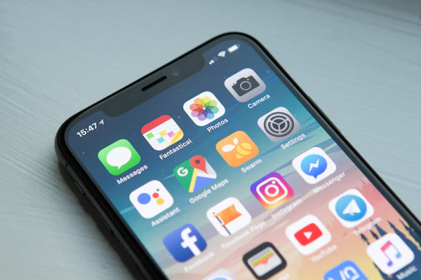
A customer is outside your job site at 4:30 PM with a tricky electrical problem. They pull out their phone to call you. Your website loads. Nothing happens for 6 seconds. They pinch-zoom to see your phone number. The text is still too small. They Google "electrician near me" instead. A competitor answers the call.
This is happening right now, probably multiple times every week. Most electrician websites work fine on a desktop but fall apart on mobile. Not because of bad design — because the site was built for computers first and phones second. That gap costs you jobs you never even see.
Here's what's broken, why it matters, and exactly how to fix it.
The core problem: 65% of your searches happen on mobile
Local searches are already biased toward mobile. People search for "electrician" or "emergency electrical repair" on their phones because they need help now. But here's the real number:
Two-thirds of the people looking for your services are on their phones. If your site doesn't work on mobile, you're surrendering two-thirds of your opportunity before anyone even clicks your phone number.
The actual problem isn't that mobile is hard. It's that most electrician sites were built 8+ years ago, before mobile search dominated. Those sites still work on desktop, so owners think they're fine. They're not.
Five specific ways electrician websites break on mobile
1. Pages take forever to load
A page that loads in 3 seconds on desktop might take 8–12 seconds on a phone over 4G. Visitors don't wait. Here's the curve:
Hit 7 seconds and nearly three-quarters of mobile users are gone. Typical culprits: uncompressed images, slow hosting, too many plugins (if you're on WordPress), or auto-playing videos.
2. The layout breaks into a narrow column that scrolls forever
The content doesn't reflow. The navigation bar is the same width as the desktop version. Buttons are stacked vertically and take up the entire screen. Users have to scroll for 30 seconds to see your service list. Most give up after 10.
3. Tap targets are impossible to hit
Your "call now" button is styled for desktop — maybe 30 pixels tall and 60 pixels wide. On a phone, that's a tiny target. Users mis-tap, get frustrated, leave.
Google recommends a minimum tap target of 48 pixels by 48 pixels. Most electrician sites are half that size on mobile.
4. No obvious way to call or text from a phone
Your phone number is in footer text. A click-to-call link would open the phone app. The site doesn't have one. Mobile users have to manually type your number or copy it, switch apps, and paste it. The activation energy is too high.
5. Forms don't work on small screens
Contact forms that fit a desktop sidebar don't work on a 375-pixel phone screen. Text input fields are tiny. The submit button is below the fold. Or the form itself is broken — maybe form validation fails silently, or the page doesn't respond to input.
What this costs you (the real number)
Let's say your website gets 50 mobile visitors per week looking for your services.
On desktop, 22% click your phone number. On mobile with a broken layout? Maybe 12%. Over 50 weekly visitors, that's 5 fewer calls per week. Five calls per week, even if only one converts to a job, is $3,000–$5,000 per month in lost revenue.
That's $36,000–$60,000 every year sitting on the table while your competitors' mobile sites work fine.
How to fix it (the practical fixes)
The viewport meta tag (the bare minimum)
If your site doesn't have this in the <head>, add it immediately:
<meta name="viewport" content="width=device-width, initial-scale=1.0">
This tells phones how to render your page. Without it, the page renders at desktop width and users pinch-zoom to read. With it, text reflows to fit the screen.
Responsive images (stop serving 4MB photos to phones)
Big, high-resolution images load slowly. Use srcset to serve smaller versions on phones:
<img src="photo.jpg" srcset="photo-small.jpg 400w, photo-medium.jpg 800w, photo-large.jpg 1200w" alt="...">
Better yet, switch to a modern format like WebP and use <picture> elements. A quality image optimization tool (like Lighthouse's image suggestions) will show you exactly which images are costing time.
Make buttons and links 48×48 pixels minimum
Your phone button should be at least 48 pixels tall and 48 pixels wide. Padding matters. If it's a text link, make it display: block; and add padding to hit the size.
Add a click-to-call link at the top of every page
For mobile visitors, your phone number should be clickable:
<a href="tel:+13035551234">Call now: (303) 555-1234</a>
On phones, that link opens the phone app. On desktop, it either does nothing or opens Skype (if installed). Users know what it is, and it takes one tap.
Switch to a fast mobile hosting plan
Slow hosting kills everything else you fix. Shared hosting plans designed for 1990s websites don't work for mobile. Look for hosting with:
- Sub-1-second TTFB (time to first byte) on mobile
- Edge caching or a CDN included
- Automatic image optimization
- Gzip/Brotli compression enabled by default
If your host is charging $3/month, your mobile speed will reflect that.
Test before you declare victory
Google's Mobile-Friendly Test will show you what's still broken. Check Core Web Vitals to see if load time, responsiveness, and visual stability pass. And do the human test: open your site on your own phone, call yourself, submit a form, scroll the services list. If it feels broken, your customers feel it too.
Want this handled for you?
RankLoft builds electrician websites that work on mobile from day one. We test on real phones, optimize for speed, and make sure the phone button works. Most clients see call volume increase within 30 days.
Get a free site audit →Common mobile failures on electrician sites (all preventable)
Here's what we see most often:
Every one of these is solvable without a full redesign. Start with the slowest load time, fix it, then move to layout. By the time you've tackled the top three, your mobile traffic will look dramatically different.
The mobile-first wins for electricians
Once your site works on mobile, things compound:
- Mobile visitors can actually call you. Conversion rate goes up.
- Google ranks mobile-friendly sites higher, especially for local searches. More organic traffic.
- Users stay longer, scroll more, see your reviews and service details. Confidence builds before they call.
- Local SEO signals like engagement and time-on-site improve your chances in the Google Maps pack.
You don't get all of this immediately. But within 60–90 days, most electricians see measurable increases in call volume just from fixing mobile.
Frequently asked questions
How much does a mobile website fix cost for electricians?
A mobile-first redesign typically costs $1,500–$4,000 depending on complexity. DIY fixes (viewport meta tag, responsive images, faster hosting) cost nothing but take time. Most electricians see ROI within 60 days if mobile users were being lost before.
What's the fastest way to test if my electrician site is mobile-broken?
Open your site on your phone right now. Try to tap the phone number. Try scrolling the service list. If you pinch-zoom to read anything, you're losing mobile customers.
Can I fix my electrician website mobile issues without rebuilding the whole site?
Yes. Start with the viewport meta tag (if missing), increase tap target sizes to 48x48 pixels, optimize images, and add a prominent click-to-call button. These don't require a full rebuild.
How does mobile performance affect Google rankings for electricians?
Google ranks mobile-friendly sites higher, especially for local searches. Core Web Vitals (page load speed, interactivity, visual stability) are now direct ranking signals. A slow, unresponsive site loses ranking points before any lead ever arrives.
Should I use a mobile app instead of fixing my website?
No. Electrician customers search Google, not app stores. A mobile-responsive website reaches 100% of searchers. Apps reach the tiny fraction who find, install, and open them.
Sources
- Google — Web Vitals: Essential metrics for a healthy site
- Google — Web Vitals measurement guide
- Google Search Central — Mobile sites guide
- Think with Google — Mobile insights and research
- Google — Cumulative Layout Shift (CLS) explained
- Google — Largest Contentful Paint (LCP) guide
- Google — First Input Delay (FID) explained
- Think with Google — Micro-moments in local search