A homeowner's roof starts leaking on a Saturday at 3 PM. They grab their phone, Google "emergency roofer near me," and find your site. They tap the link, the page takes 8 seconds to load, and the phone number requires zooming in to tap without hitting the address below it. By second 5, they've already gone to your competitor's site instead.
This happens to roofer websites constantly. Most were designed for desktop, then someone shoehorned them into mobile view without fixing the actual problems. The result is lost calls, lost jobs, and lost revenue. And Google knows it — Google's mobile-first indexing means your mobile experience is your site's ranking factor, so a broken mobile site tanks both your lead flow and your search visibility.
The good news: fixing mobile design isn't a rebuild. It's fixing specific, concrete problems that most roofer sites share.
The quick verdict
Most roofer websites fail on mobile because they prioritize looking good on desktop. They use tiny tap targets (buttons too small to hit reliably), don't compress images so pages load in 8+ seconds, and lack responsive breakpoints that reflow content for smaller screens. The result: 30% fewer mobile visitors even engage with your site, and 50% bounce before the page fully loads.
A mobile-optimized roofer site does four things differently: responsive layouts that reflow naturally, compressed images that load in under 3 seconds, tap targets sized for thumbs (at least 48×48 pixels), and one-tap calling via tel: links. Sites that do this see 3× the conversion rate on mobile versus those that don't.
What mobile-poor roofer sites get wrong
Walk through any roofer website on your phone. You'll find the same patterns breaking over and over.
Tiny tap targets that frustrate visitors. A phone number that's 14px wide and sits 8 pixels from the address? That's unusable on a touchscreen. Your thumb is about 58 pixels wide. When you ask someone to hit a 14px target, half your clicks hit the wrong link. Google counts this as a mobile usability failure, and it definitely counts as a lost call for you.
Images that are desktop-sized on mobile. A hero image might be 2MB and sized for a 1920px desktop screen. On mobile, that image loads at 1/10th the resolution but still downloads the full 2MB file, wasting seconds of load time. Add five more hero images, testimonial photos, and before/after galleries, and your site takes 10–15 seconds to load over 4G. Google's Core Web Vitals explicitly penalize pages that load slowly, and every extra second costs you visitors.
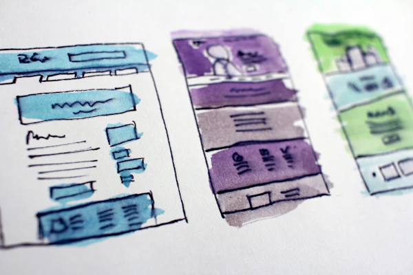
Layouts that don't reflow. A desktop site might show your three service cards side-by-side in a row. On mobile at 375px wide, they stay side-by-side and become unreadable thumbnails. No one scrolls through nine tiny cards. A responsive layout stacks those three cards vertically so they're readable at phone size.
No click-to-call. Lots of roofer sites display a phone number as plain text. On desktop, that's fine — people copy it. On mobile, it's friction. They have to select, copy, switch to the phone app, paste, then call. Most don't. A tel: link lets them tap and call in one gesture.
Forms that are impossible on mobile keyboards. A contact form that uses a dropdown with 50 states, a date picker that requires precise clicking, or text inputs that don't match the keyboard type (phone numbers should show the phone keyboard, not the letter keyboard) — all friction, all lost leads.
What mobile-optimized roofer sites do right
A roofer site built for mobile works because it starts with the constraint. Instead of fitting desktop onto phones, it builds for phones first and scales up.
Responsive grid layouts. Your service cards, testimonials, and before/after galleries reflow automatically. On mobile they're one column (readable). On tablet, two columns. On desktop, three columns. One HTML, one CSS rule, zero duplicate code.
Compressed images. A 2MB hero photo gets resized to 600px wide, compressed to JPEG (quality 75–80%), and serves as maybe 80–120KB. Your before/after gallery photos get cropped to a 4:3 ratio, resized to 800px max, and compressed to 100–150KB each. The full page loads in under 3 seconds on 4G instead of 10–15 seconds.
Touch-friendly buttons and links. Every tap target is at least 48×48 CSS pixels (your phone has density so this varies by device, but the principle is: make things finger-hittable). Phone numbers are tel: links. Email addresses are mailto: links. Buttons have padding. People can tap them without accidentally hitting something next to them.
Mobile-first forms. A "request an estimate" form on mobile shows: Name (text), Phone (tel input shows the numeric keyboard), Service (dropdown with 5–8 key services, not 50), Date preference (date picker, not text field), Notes (multiline textarea). No optional fields that clutter the form on a tiny screen.
Type hierarchy and spacing. On desktop, a headline might be 48px with 40px of space below it. On mobile, that same space might look enormous, so it reflows to 32px headline with 24px space. Readability stays good across all screen sizes without looking cramped or swimming in whitespace.
Side-by-side: what matters for roofers
| Factor | Mobile-Poor Site | Mobile-Optimized Site |
|---|---|---|
| Page load time (4G) | 8–15 seconds | Under 3 seconds |
| Tap target size | 14–24px (hard to hit) | 48px+ (easy for thumbs) |
| Phone number | Plain text or soft link | tel: link, tap to call instantly |
| Images (hero) | 2–5MB each, desktop-sized | 100–200KB, mobile-sized |
| Layout | Fixed width, no reflow, horizontal scroll | Responsive grid, one-column on mobile |
| Google ranking | Penalized for mobile usability | Preferred in mobile-first indexing |
| Mobile conversion rate | 0.8–1.5% | 2.5–4.0% |
What roofers often get wrong about mobile
Assuming a separate mobile site will work. Old wisdom says build m.yoursite.com for mobile and www.yoursite.com for desktop. Don't. Google's mobile-first indexing ranks based on the mobile version, so a separate mobile site gets half the link juice and creates maintenance headaches. Responsive design — one site that adapts — is the only approach that matters.
Skipping image optimization. Roofer sites are visual. That's why they have gallery after gallery. But if each gallery photo is 3MB, you've got 15MB of images. Optimize before you upload. Use a tool like TinyPNG or ImageOptim to compress, or better yet, use a tool like Squoosh that lets you resize and compress in one step. If you're not sure how much this is costing you, run a roofer website speed test and see the load time for yourself.
Not testing on real 4G, on real phones. Your desktop development machine might load a page instantly over Wi-Fi. A customer on an actual 4G connection will wait 8+ seconds. Use Chrome DevTools to throttle to "Slow 4G" and test on your own phone with 4G enabled. If it feels slow to you, your customers are bouncing.
Forgetting that mobile users are in a hurry. Desktop users browse. Mobile users need an answer now. They found your site because their roof is leaking or they're getting quotes. Make your phone number the first thing they see. Make the "request an estimate" button obvious. Don't make them scroll through your company history to find out how to contact you. A full roofer website SEO audit will catch these gaps alongside the mobile ones.
Mobile speed and layout are half the story — the other half is whether Google can find you in the first place. Our roofer local SEO playbook covers what to fix once your site actually loads fast.
Want this handled for you?
RankLoft builds, ranks, and maintains your site so you can focus on the work. We optimize every image, test on real mobile devices, and make sure every tap target works on the first try.
Get a free site audit →The bottom line — which approach to pick
If your roofer website was built more than 2–3 years ago and you haven't had it audited for mobile since then, it's broken. It's probably slow, probably has tiny tap targets, and probably isn't ranking as high in Google as it could be.
Start with a mobile test: visit your own site on your phone. Can you tap the phone number without hitting something else? Does the page load in under 5 seconds? Can you read the service cards without pinching? If you're saying no to any of those, you're losing calls every day.
The fix doesn't have to be a full rebuild. Start with what hurts most: compress hero images, make sure phone numbers are tel: links, increase button sizes, and test on your phone before deploying. Those four changes alone can double your mobile conversion rate. Then move on to full page speed optimization and a full responsive layout — or read our complete web-presence guide for roofers for the bigger picture. If you're weighing whether to fix the current site or start over, see freelancer vs. agency for roofer web design. But start now — every week your site stays broken on mobile is a week of lost revenue.
Frequently asked questions
What's the most common mobile website mistake roofers make?
Not making phone numbers clickable. When a customer finds your site on their phone and has to type a 10-digit number to call you, half of them won't bother. Every phone number on a roofer website needs a tel: link.
How long should a roofer website take to load on 4G?
Under 3 seconds. Most roofer sites load in 5–8 seconds on mobile 4G, which means you're losing 30% of visitors before they even see your price or photos. Compress images, remove unnecessary scripts, and test on actual 4G to know where you stand.
Do I need a separate mobile site or is responsive design enough?
Responsive design is the only approach that works. A separate mobile site (m.yoursite.com) is outdated and hurts your SEO. Google's mobile-first indexing means your mobile experience IS your site's ranking factor. One responsive codebase wins.
Why does Google care so much about mobile design?
Because 63% of web traffic is mobile. Google's ranking algorithm reflects that — mobile-friendly sites rank higher in search because that's where the users are. If your site doesn't work on mobile, Google assumes it doesn't work for most people.
What are the easiest mobile improvements a roofer can make?
Start with these four: (1) make all phone numbers click-to-call, (2) compress hero images to under 200KB, (3) increase button/link sizes to at least 48×48 pixels, (4) test your site on your own phone and fix anything that requires pinching/zooming.